Team members
Supervisors
Ajay Anand, Pedro Fernandez
Department of Data Science, UR
Sponsors
Lloyd Palum, Mathew Mayo
Vnomics Corporation
Introduction
Vision: Identify scenarios where DPF (Diesel Particulate Filter) failure is likely to happen so that the customer can be alerted in advance to avoid costly roadside breakdowns.
Goal: By performing data preprocessing, data visualization, and building classification models, we would like to have our outputs be recall scores and confusion matrices of classification results.
Terminology and Features
DPF (Diesel Particulate Filter): a filter in the truck that filters out environmentally harmful matter from exhaust gases; truck will self-clean its filter during operation
DPF failure: a situation where the filter’s self-cleaning (regeneration) does not work properly; and to a point, the filter is so clogged that it cannot be cleaned solely through regeneration, thus needs maintenance.
dpf_regen_inhibited_duration: the total duration (minutes) where dpf regeneration is inhibited for the day, in this case, regeneration cannot occur even if it needs to, and dpf_regen_not_inhibited_duration is the reverse.
dpf_regen_active: the total duration (minutes) where dpf regeneration is active for the day, which means regeneration is taking place, and dpf_regen_not_active is the reverse
dpf_regen_needed_duration_mins: the total duration (minutes) where dpf regeneration is reported as being needed for the day, in which regeneration is needed but is not taking place. We regard this parameter as a critical sign of an upcoming failure.
DTC (Diagnostic Trouble Codes): leading up to DPF failure, the trucks may throw one or more DTCs. Each DTC consists of an SPN code and an FMI code. The combination of these codes will return any possible issue of a truck, thus yielding thousands of possible outcomes.
Data Preprocessing & Cleaning
- Data merging
The raw data we got has one dataset for each individual truck, in a total of 161 CSV files. We merged them all together and got a big dataframe with all data.
- Data cleaning
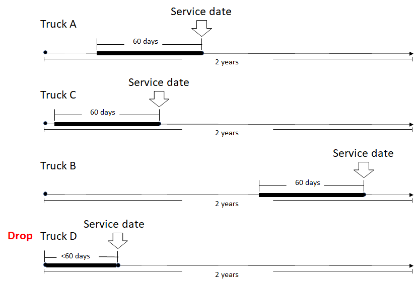
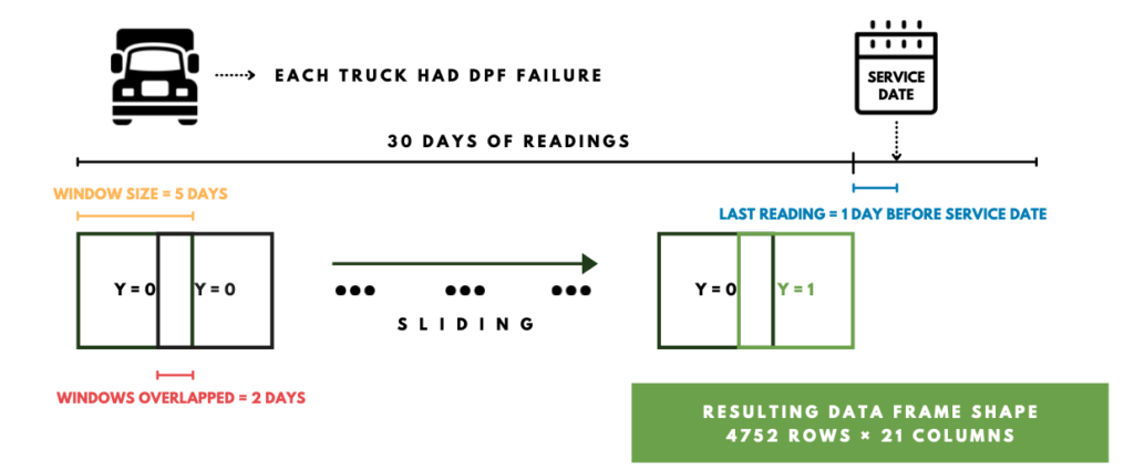
We imputed null data based on the data of the previous day since we needed continuous time series. We added features “month” and “vehicle year”, which we thought might give us some patterns. We also added DTC. After communicating with our sponsor, we kept only 8 of the DTC pairs that were related to DPF failures. We only kept the trucks with DPF failures and dropped all others. Within these trucks, we kept the data 30 days before the service date, and later based on our tuning result we changed the length to 60 days. As illustrated in the graph below, the service date is indicated by the arrow, and the bold lines are the data we choose. No matter when the service date was, we only kept 60 days before that. If a truck, like truck D, didn’t have enough data, we dropped the truck.
Finally, we got 87 trucks left. In total there are 5220 rows of raw data.
- Target variable
We set our target variable (y=1) 3 days before the actual failure date in order to predict the failure in advance. For all the other dates (rows), their y values were set 0.
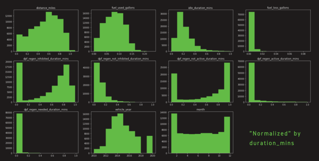
- Data Normalization
We normalized the data based on duration mins. Because data from a truck that works over 10 hours per day is not comparable to a truck that only works a few minutes per day. So we divided every numeric variable by the corresponding duration mins. In this way, we normalized the numerical data and were able to compoare them across different trucks.
Explorative Data Analysis
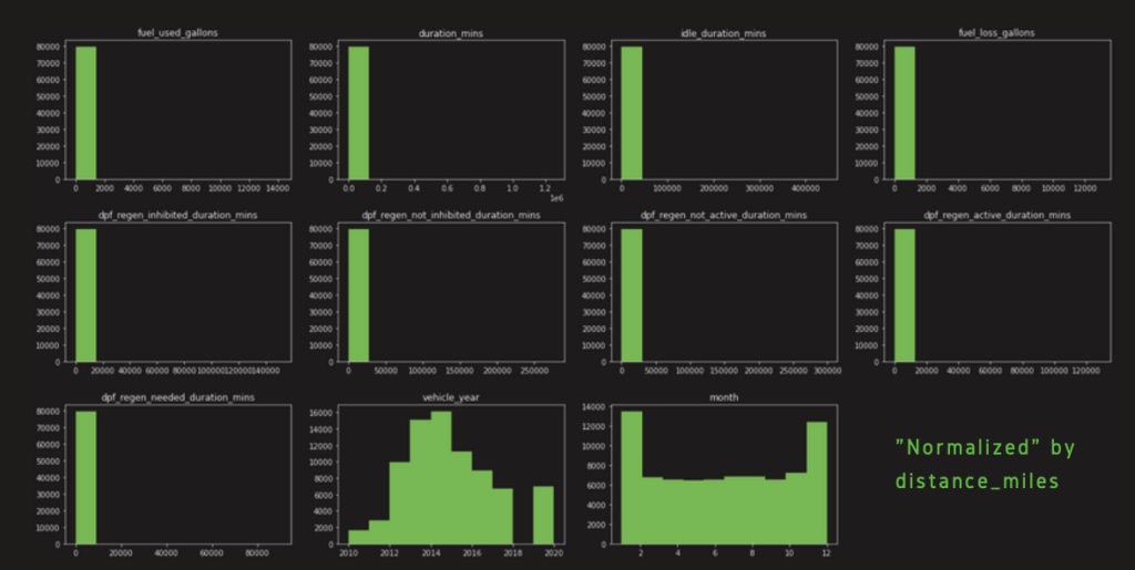
As mentioned earlier, it is necessary to normalize the numerical data. Here, we used histograms and correlation coefficients to examine which normalization methods we should utilize. We chose to normalize the data by “distance_miles” first. However, as might be seen in the histograms, the distributions of all features
The graph below is the correlation coefficient across all different features. The data here has been normalized by duration mins. Comparing to the correlation we had from data normalized by distance miles, we saw an increase in the linear relationship between the dependent variables “dpf_failure_2weeks” and all other explanatory variables. In addition, we found two sets of explanatory variables that had very high correlations. The first one is “fuel_used_gallons” and “distance_miles”, which were highlighted in blue boxes. Their correlation was 0.96. Another one is “dpf_regen_not_active_duration_mins” and “dpf_regen_inhibited_duration_mins”, which were highlighted in the yellow boxes. Their correlation was 0.85.
We also noticed that the correlation coefficient has decreased a lot between most of the explanatory features after we normalized the data by “duration_mins”.
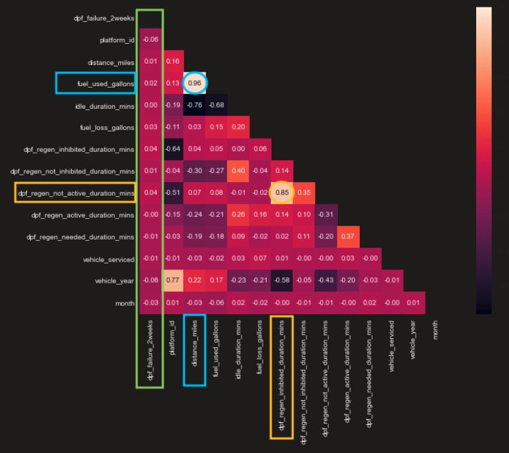
Since the data was more reasonable when it was normalized by duration_mins, we decided to go ahead and use this normalization for our data.
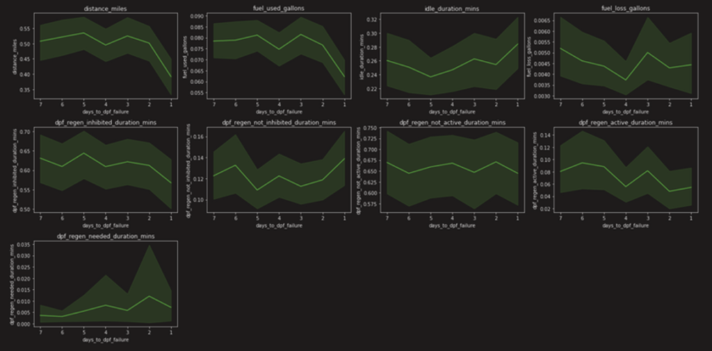
Then we compared line plots for different windowing intervals. We selected 7 days, 14 days, and 30 days as windowing intervals. X-axis is the number of days to the service date, i.e. the end of the x-axis is the service date (failure date). And y-axis is the value for corresponding features.
The graph below is the plot for 7 days. Dark green lines are the average trend, and light green areas are the 95 percent confidence intervals. We can see from this graph that, starting from 4 days before failure, there was a downward trend for the first two rows (8 graphs), but an upward trend for the last graph. We interpret it as, when the failure is about to occur, the truck is driven less, thus less the distance miles, fuel used, etc, yet higher the regeneration duration needed because the truck is not able to regenerate itself.
Then we
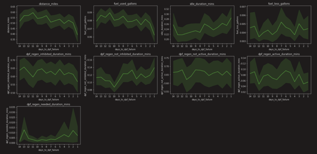
The graph below is for 14 days. And we see the trend is valid between 3 to 5 days before failure.
And down below is for 30 days, we can see more clearly that the trend is valid 5 days before the failure date.
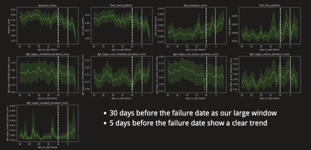
Thus according to our explorative data analysis, our raw data (also called the base data) was normalized by “duration_mins data”, with 5 days’ data before service date counting as failure. That is, only those data that are 5 days before the service date are counted as y equals to 1. Later, based on our
Methods and Results
- tsfresh
In feature engineering, we used python package
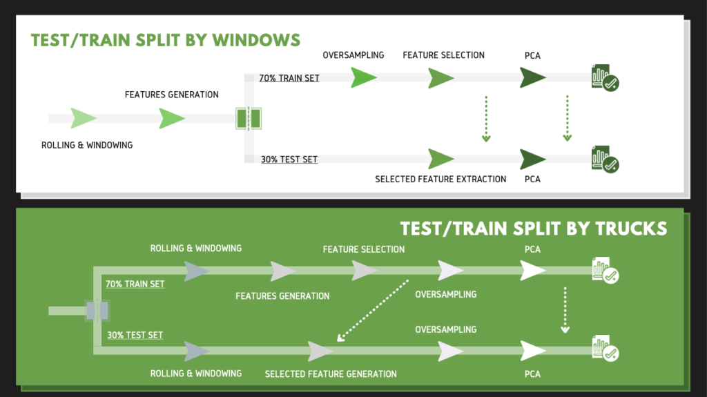
The graph below this paragraph is an overview of the process of our feature engineering. We separated it into two scenarios, the upper one is test/train split based on windows. The one below is splitting by the trucks. The key difference here is where the test/train split takes place. Instead of splitting at the start, the splitting by windows one split after features generation. Since there are only 88 trucks used in our data, we believe splitting by windows can focus on driving behaviors and eliminate the differences between each truck. Therefore, we proceeded with splitting by windows (the one below).
To help understand the process, we will use our baseline model to introduce each stage, as illustrated in the graph below. (Because it’s the baseline, the days we used are different from our final model. Nevertheless, it is the concept that matters.) The first part is rolling and windowing to convert the data into windows. This part is powered by tsfresh. In order to predict failure in advance, we left 1 day out and moved y = 1 to one day before the service date, shown in blue. We used 30 days of data, so the data starts from 31 days before the
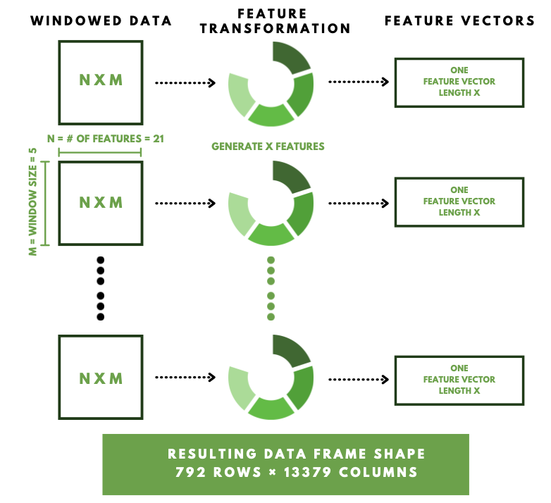
After we got windowed data, we used tsFresh to generate a large number of time series characterized features. Each window has 5 days of readings and 21 features to feed in tsfresh. We used ComprehensiveParameters that calculates all tsfresh features. After feature generation, each window will become a feature vector with a length of 13379. The resulting data frame has 792 rows and 13379 columns.
Out of these 792 rows of data, we only had 88 of them that have a y = 1. In order to solve the imbalance classes here, we utilized SMOTE to oversample the minority class, and we got balanced classes as a result. Then we conducted
- Modeling
We measured our models based on Recall value.
We fit the data obtained previously into 9 models: Logistics Regression, SVM, Random Forest, KNN, Extra Trees, Naive Bayes, Decision Tree, Bagging, Gradient Boosting. Here we’re using Logistics Regression as an example to show our result.
- Tuning
After constructing the baseline model, we tuned five groups of parameters.
The first one is moving the date we set as y=1 further in advance. Our baseline model sets the y=1 date only one day before the actual recorded service date, that means we’re only able to predict failure, one day before the failure. So we moved the y=1, 2 to 5 days before the service date. Results show that 1 day and 3 days before service date have similar model recall, which are higher than any other days. And since three days before service date allows us to predict failure earlier and thus give truck drivers higher flexibility, we are choosing 3 days before service date as the y=1.
The second parameter we tuned was the overlap days in tsfresh windowing. In the baseline model, we tried 40 to 80 percent of overlapping, that’s from overlap of 2 days to 4 days in a total of 5 days windowing. Results show that 80 percent (or 4 days) of overlapping has the highest recall from the best performance model.
Then our third try was on the tuning of the failure date. We changed failure days along with overlapping days. For the failure date, we tried 5 days, 6 days, and 10 days. While we were trying, we figured that when we increased the windowing period from 5 days to 10 days, there’s a decrease of almost half of the after-rolling data entries. To make them comparable, we enlarged the total data used for 10-day windowing from 30 days to 60 days. For overlapping days we tried a range between 70% to 90%. Note here that the percentage is the actual percentage. For example, in our baseline model of 5 days, 70% to 90% overlap all correspond to 4 days of overlapping after the roundup, but we will use 80%,
The fourth parameter we tuned was a setting in tsfresh’s extraction function. There are three predefined dictionaries, ComprehensiveFCParameter, EfficientFCParameter, and MinimalFCParameter. We ran each of them. Results show that comprehensive and efficient give only a 2% difference in recall. But Comprehensive has a runtime of around half an hour, efficient has a runtime of only 5 minutes, so we decided to use efficientFCParameter.
The fifth parameter we will be focusing on after we solve the small problem will be the model parameters. By changing
Conclusions
Due to the mistake that we made in tsfresh, we are still tuning our last part of the model. The highest recall value we got before tuning is around 60%, which means out of those trucks experiencing failure, we have 60% confidence that we will predict the failure. This result is better than we expected due to the fact that we didn’t have a lot of data, and the data is very unbalanced (for 161 trucks in two years, we only have 87 rows of data that can be count as y=1, that’s 87 out of 10225110). We do think we can improve the model performance by further tuning. But upon that, we also think there are several other things to do.
Firstly, we could still try to split our data by trucks at the tsfresh rolling step. By doing that we can test our model validity.
Secondly, we could try to predict normal trucks. We can predict the performance of normal trucks and set a standard for that. Then if a truck doesn’t meet this standard, we can predict that this truck will have a failure. The problem with this method is that if we don’t have enough normal trucks, we won’t be able to include all the normal driving behavior for our “normal standard”.
We will try these methods and some other steps to improve our model performance before the semester ends. We will update our further change, and if you have any questions and suggestions, please leave us a comment below!
Acknowledgment
We would like to express our sincere gratitude to Professor Anand, Professor
Reference
https://tsfresh.readthedocs.io/en/latest/text/introduction.html
https://github.com/blue-yonder/tsfresh/tree/main/notebooks/advanced